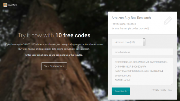
I recently learned about KickOffLabs and their live Google Hangout landing page review sessions. I decided to check it and toss in my recently redesigned NovelRank Buy Box tool and more specifically, the trial landing page I built for advertising traffic.
For the purposes of this post, I’ve saved the page as it existed at the time of the review. Here is a summary of the feedback I received from KickOffLabs:
- Remove Testimonials call-to-action button confusion and migrate the testimonials higher in the page.
- Update the testimonial images to be real-people faces.
- Remove the ‘My Test Batch’ naming field (this was a UX (User eXperience) revelation from them using it) as unnecessary.
- Make the call-to-action lower in the page focus on the form.
- “Speak to me like I’m a golden retriever.” Update the language to better answer the question, “Who is this for and what does it give me?”
- Provide social sharing after submitting the trial batch and an incentive for doing so.
- Don’t auto-redirect users on the trial completion page.
As a developer and theme designer, this was all work I would do. For most people, templates that accomplish all this already are very desirable and that’s where KickOffLabs‘ services come into play, so definitely check them out.
I took the advice to heart and have redesigned the page a little. You can look at all of the improvements right now: https://web.archive.org/web/20170727094931/https://buybox.novelrank.com/trial. Any further feedback is welcome in the comments below!
Update: May 28, 2015
Some additional feedback that has also been addressed:
- Increase font-size of the primary use case for the site
- Change ‘Start Batch’ to something friendlier
- Ensure the batch is delivered quickly, regardless of the current system usage


