Facebook has offered an easy way to add individual events to your calendar, however it’s less obvious how to automatically make this happen. Luckily, it’s relatively simple using Facebook’s own help pages as a starting point.
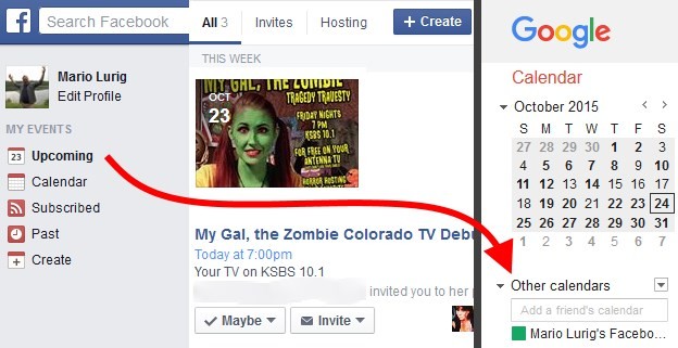

Facebook has offered an easy way to add individual events to your calendar, however it’s less obvious how to automatically make this happen. Luckily, it’s relatively simple using Facebook’s own help pages as a starting point.
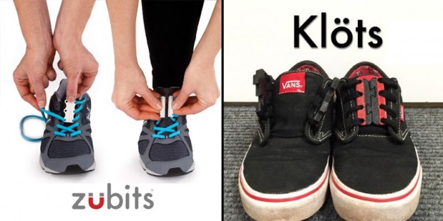
I’ll be honest, I don’t like tying or untying my shoelaces. Typically, I would just leave them tied relatively loose and them over time abuse the shoe by getting in and out of it without touching the laces. Why? This may be too honest, but frankly, at the time of this post I’m overweight and my gut gets in the way and it’s not at all comfortable. There has to be an easier way, right?
Turns out there is, and the answer is in a custom closure. Sure, you could get some Velcro closed sneakers, but what if you want to try and maintain the sneaker look and snugness and get the ease of getting in and out of them without touching a shoelace? What if it is not a sneaker at all? Enter two options I’m going to quickly compare: Zubits and Klöts.
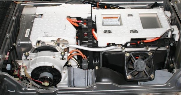
My Honda Insight hybrid is a 2002 model and has already had its battery pack replaced in 2008. Well, in its 13th year (7 years on the new pack), the pack started reporting degradation of the battery requiring some decisions. Considering the value of a car with 165,000 miles and 13 years on it, replacing the pack (even with a refurbished/reconditioned battery) would constitute over 50% of the value of the vehicle, so it’s not a good idea at this point IMHO.
That leaves two options, but if you found this article then I need you to learn from my mistakes:
The Honda Insight, at its core, is a 3-cylinder 67-hp engine and can function without the battery with the loss of auto-stop, regenerative braking, and some MPG. However, depending on when your pack was made, the decision above will be made for you. To explain, I’ll briefly tell you my experience and logic.
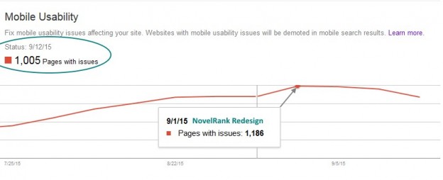
On April 21, 2015, Google started demoting search rankings for websites that were not mobile-friendly. Prior to that date, I updated 11 of 12 websites I run. The big one, NovelRank, was going to take much longer and be much more complicated, so it missed the deadline.
Well, on September 1st, the redesign was completed and released. However, as you can see in the image above, the story still isn’t over. Even though it’s been 2 weeks since the redesign, Google took ~7 days to update to the new link structure (dropped .php) in search results. It also has only identified 15% of pages that previously had mobile errors as fixed. Needless to say, it’s going to be a few more weeks until the benefits (or rather, the removal of penalties) are actually reflected across the entire website in the eyes of the major search engines.
So be warned, that delay means that when you think you’re done, the search engines of the world may not see it that way for weeks after. You’re already behind, so don’t delay on getting your sites mobile-friendly. I personally love Bootstrap, if you want a recommendation for a responsive design framework.
Mobile errors dropped dramatically, down to 89 total (8% of the original). So, after 3 weeks the vast majority of the mobile-friendly redesign was absorbed into Google’s knowledge of the site. I expect that by the end of the month the number will be zero or a single digit total.
After seeing 5 pages with mobility issues for lingering pages not rechecked by Google’s crawler for the last month, the number is finally 0. For most sites it would have been done by the 1 month mark, but for a larger site (thousands or tens-of-thousands of pages like mine) it took 2 months to get a 100% seal of mobile approval.

Who am I to criticize Denver Comic Con? The organization has changed a lot in the 4 years from inception, including removing founders, hiring and firing executive directors, and so much more. More importantly, I’ve played many roles inside and out of the convention since it’s inception. I started with a press pass in year 1, then I was media as one of the official photographers in year 2. By year 3 I was on staff in charge of the official media team (photographers/videographers) and also part of the overall communications team. Due to various reasons, I chose not to continue as a volunteer for DCC in year 4 and purchased a 3-day pass and was an attendee like any other, without any special privileges.
Hopefully that’s enough to convince you that I have some credibility in regards to the following critique. Now, I think there are some things that DCC is doing right (e.g. kid’s corral and educator day), but after this year the excuse of “still learning” is no longer viable and lessons should be learned before the general public loses faith in the event.
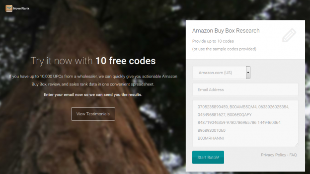
I recently learned about KickOffLabs and their live Google Hangout landing page review sessions. I decided to check it and toss in my recently redesigned NovelRank Buy Box tool and more specifically, the trial landing page I built for advertising traffic.
For the purposes of this post, I’ve saved the page as it existed at the time of the review. Here is a summary of the feedback I received from KickOffLabs:
As a developer and theme designer, this was all work I would do. For most people, templates that accomplish all this already are very desirable and that’s where KickOffLabs‘ services come into play, so definitely check them out.
I took the advice to heart and have redesigned the page a little. You can look at all of the improvements right now: https://web.archive.org/web/20170727094931/https://buybox.novelrank.com/trial. Any further feedback is welcome in the comments below!
Some additional feedback that has also been addressed:
So here is a quick tutorial on how to construct the graph shown above, showing the distribution of messages over a given time period. First of all we must obtain the dataset we are going to use, which for this tutorial is the chat history obtained from WhatsApp. This can be obtained following these instructions or for iMessages or FaceTime data you can use this (paid) software.This tutorial is posted with permission by Prometheus09 on Reddit. It was originally posted as an album on Imgur.